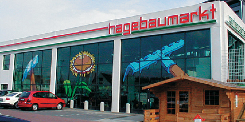
Redesigned façade with large pictograms on windows and walls.
New external appearance
From the middle of 2002 Hagebau will be presenting itself throughout Germany in a new exterior livery: the octagonal logo will remain, though red and green will be brought more strikingly into the foreground. The customer guidance and information system is being given colourful support. The pale grey floor in the store will contrast with the surfaces of the décor and informational elements that are done throughout in the green and red Hagebau colours. These are also dominant on the newly designed shelf headers. The new design is evident in the colour-coordinated danglers as well, which make finding your way round the store easier, with silver indicating hardware, as one example, or yellow for paints and varnishes. Revamped dump baskets in the entrance area for promotional goods, and new wood-and-metal combination tables for special offers featuring trendy pale birch complete the modern look.
Rack headers in the group’s colours and colour-coordinated danglers are all part of the new look.
At a total of 3.40 metres the new racking system is a full metre taller than previously, creating additional space for visible stocks up on high. An overhanging lighting panel shows the goods on display in a favourable light. The clear layout of the light grey interior racking is designed to facilitate concentration on the product and make customers stay longer. Better lighting coverage of the entire sales area is also an integral part of the new concept. The creed has it that light creates liking – and according to calculations done by the Hagebau experts, a luminous intensity of 700 lux is ideal.
The newly conceived bakeshop looks after customers’ physical wellbeing.
Bakeshop, kids’ paradise and plant hire
New developments from the planning department include bakeshop, kids’ paradise and plant hire modules. The space-saving kids’ paradise is available in a variety of sizes from ten to 30 m². Here children can…


