The garden centre of the future exists in three versions – at least in the opinion of Thermoflor, who have presented a three-part conceptual study on the subject
Thermoflor, as a company that builds garden centres, is faced with this same question. Gertjan Grimbergen’s management team wanted to find out more, so invited a group of garden centre operators, shop fitters, manufacturers, trendsetters and designers to sit round the table with them. There they were confronted with the question: What does the garden centre of the future look like?
But they soon noticed that the wrong question had obviously been asked: there is not just one concept of the future, rather a multiplicity of concepts. Three of them have crystallised out into definite concepts, and Thermoflor has worked out three detailed studies, taking a standard area of 6 000 m² as their basis.
Transparent, clear-cut and functional: “Modern Design”.
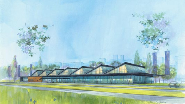
The concept that relies most decidedly on simplicity has been named “Modern Design“. It is modelled on urban man, and as a building characterised by functionality. There is a need to control the incidence of light, since not only specifically garden centre products are sold in such a store. This is achieved by means of an asymmetrically constructed roof, with a long, shaded section facing south and a short, transparent section facing north to let in more diffuse light. Positioned around this core is an area of flat roofing where, for example, storage space can be accommodated. The external look features large areas of glass alternating with modern materials like plastics, stainless steel and aluminium.
The keywords linked to this concept are “efficiency“, “logistic solutions“ and “transparency“. “Modern Design“ is certainly the least “green“ of the concepts – and, perhaps not least because of this, the one that export manager Ferry Breugem considers to be most compatible with DIY stores.
Eco-friendly, sustainable and full of adventure: "Nature Design".
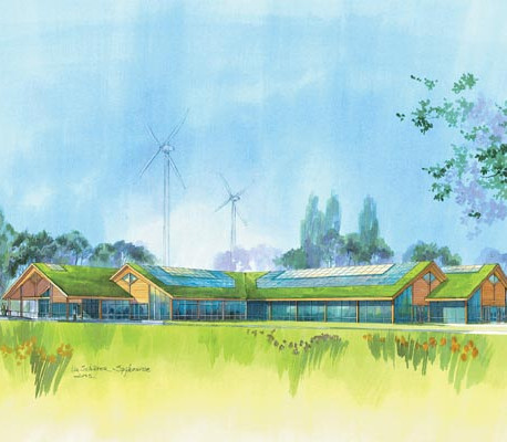
By contrast, there is a considerably more effective green bottom line in the other two studies. In the second concept, the name of “Nature Design“ is doubly appropriate, since “nature“ is defined here not only as having to do with plants, but also as the environment: hence the eco-friendly garden centre. On the one hand it is energy-saving through the use of new glass systems with a low K factor and a new type of IQ heating glass, the avoidance of thermal bridges, the installation of gutter and floor insulation and more efficiently insulated sandwich panels; less costly measures, such as more efficiently designed vestibules, are also included in the considerations. On the other hand, it makes use of renewable sources of energy that include solar collectors, heat pumps and wind turbines.
This results in reducing energy consumption by around one-third, though at the same time increasing investment costs by around 20 per cent. Ferry Breugem estimates the amortisation period at between 15 and 20 years. Which could change with the rising energy prices. “Saving energy is no longer a matter of choice but of necessity,“ in his assessment.
The intention is to appeal to individuals who choose to spend their leisure time in touch with nature, and to allow them a great deal of freedom. Which is why there is no fixed routing in the store. Instead, customers are expected to be attracted from one display to the next, and so take a different route on every visit.
Based like a Romanesque church on a cruciform ground plan, the building with its low, chalet-like appearance is designed to fit naturally into rural surroundings. And use is of course made of natural materials such as wood.
Romantic, nostalgic and decorative: "Classic Design".
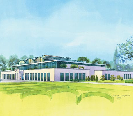
The third concept, “Classic Design“, is totally geared to the core business of plants and flowers and to appealing to customers’ emotions. This is obvious from the “orangery“ style that characterises the building with its curved roof structure. The central atrium, which has a balcony surrounding it on all sides, is designed to astonish visitors by the sheer height of the arched roof with its ridge rising from 12 to 14 m. “Plants, botany and gardens are experienced most intensely here,“ says the study in its summary.
The concept has been given a strong dose of romanticism and nostalgia to achieve this aim. Decorative materials, ornamentation and pastel shades combine with rounded shapes to create an atmosphere of well-being. Many elements of the greenhouse structure form a recognisable link with the architecture of the past.
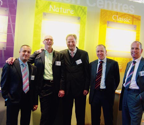
Gertjan Grimbergen (2nd right) and his team: Tansel Acar, Ferry Breugem, Peter Rense and Ben Boon (left to right).
These concept studies (presented with many more illustrations at www.futuregardencentres.com) are not an end in themselves: the underlying question concerns the optimum use of space. Which is the reason for the second floor in the “Classic“ model, and for the relatively small outdoor areas: nursery sections are less profitable, with sales/m² for outdoor yards achieving only a quarter of the figures generated by heated sales areas.
The three concepts will never be realised in their original form. The philosophy and individuality of the operator, which have contributed to the creation of the store’s image and identity, must be retained, according to Ferry Breugem. “The final result will always be a mixture.“
